This tutorial shows you how to use this new feature (available in version 2020.4) in the classic way, illustrated by an example proposed by Jeffrey Shaffer on his blog, where he cracks the functionality to create new visuals.
Content proposed by Nicolas Arbona Casado – BI Consultant
Classic” use of functionality
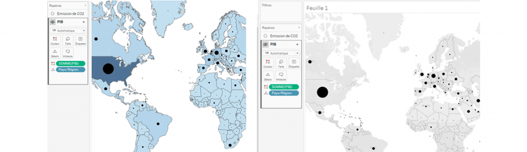
1) Create a map with multiple layers. a. Open Tableau Desktop and connect a source with multiple geographic roles. Note that it is also possible to connect two sources with only one geographic role each. b. In the spreadsheet, drag one of the geographic fields to create a map. c. Then drag a second geographic field onto the map to see the ‘Add a marks layer’ option appear. Release the field: you have created a map with several layers.
2) Rename layers. a. Once you have created your layers, you can rename each of them in the marker shelf (either by double-clicking on the field, or using the arrow).
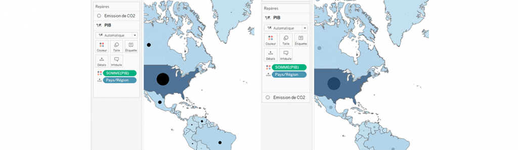
3) Adjust the readability of layers. a. You can choose to show or hide certain layers by hovering your mouse over the marker shelves: an eye icon should appear (note that you can do this via the drop-down menu of each marker.
b. It is also possible to rearrange the order of layers, to move a layer to the foreground or backwards (the uppermost position will be the foreground).
4) Activate/deactivate layer selection. a. Using the drop-down menu for each layer, it is possible to activate or deactivate selection: the layer will not disappear, but it will no longer be possible to click on it once selection is deactivated.
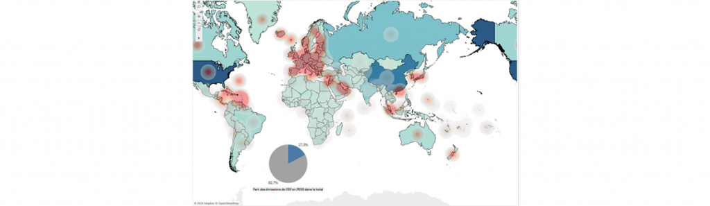
After browsing the resources available on the Internet, and in particular Jeffrey Shaffer’s blog, here’s a more advanced example of using map layers. In this example, and using the ‘MakePoint’ feature to set visualizations on a map, we’ll combine two ‘classic’ map layers and a pie chart layer.
1) Connect to the ‘world indicators’ data source in the registered table sources. 2) Double-click on the ‘country/region’ field to generate a map. 3) Drag the same fields onto the existing map to add a map layer. 4) On the first layer, we’ll display the Internet usage indicator by country. a. Rename the layer ‘Internet usage’. b. change marker type to ‘density’. c. Add the Internet usage field in color and change the colors to ‘red-gray light’ with 90% intensity and 40% opacity.
5) The second layer will allow us to represent energy consumption. a. Rename the layer ‘energy consumption’. b. Change marker type to ‘map’. c. Drag the sum of energy consumption in color. At this stage, you have a map-type graph with two layers, one to represent Internet use by country, the other to represent energy consumption by country. We’re now going to add a pie chart-type graph on the two previous layers to represent CO2 emissions in 2010 as part of total CO2 emissions. To do this, we’ll need to create several calculated fields to position the graph, know the CO2 emissions in 2010 and finally create a set to configure an action on the sheet.
1) Create a calculated MAKEPOINT field to position our pie chart on the map (here we’ve chosen to place the graph in southern Africa, but the values allow it to be placed anywhere). makepoint(-50, -10) 2) Create a calculated MAKEPOINT field to position the title of our pie chart. makepoint(-50, -10) 3) Create a calculated field to find out CO2 emissions in 2010. if DATEPART(‘year’, [Year]) = 2010 then [CO2 emissions] end 4) Create a set of country/region fields. 5) Configure a country overflight action, updating the pie chart according to the country overflown. 6) Position the Makepoint fields on the map to create two new layers and configure the pie chart. There you go!
This new feature will allow you to create map layers, but not only.
In fact, when you create a map, the longitude and latitude fields are placed on the column and row shelves respectively, creating a map. But by inverting the columns and rows, Tableau will automatically generate a point cloud.
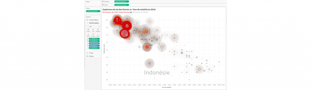
In his example, Jeffrey Shaffer uses this manipulation to create a point cloud with several layers. You’ll need to build the map, add the fields needed to create the layers and then invert the rows/columns. Here’s the result (the methodology is available here ).
This graph shows female life expectancy and birth rate in 2010, as well as C02 emissions by country. A line allows you to visualize the evolution of a country by hovering over it with your mouse. Jeffrey Shaffer uses this new map layer functionality to create a multi-layered point cloud visualization.