How to choose the right color palette for data visualization?
Written by Simon Jahan – Actinvision BI Consultant
The data visualizations we create make it possible to understand and interpret information in a mass of data that is difficult to interpret with the naked eye. That’s why, as Data Analysts, our role is to highlight data through functional and intuitive dashboards.
Colors play an essential role in highlighting the information we make available to users. Omnipresent in our daily lives, in the advertisements, websites and applications we consult, colors attract the eye, decorate and communicate information.
There are several factors to take into account when choosing colors for a dashboard. Firstly, choose colors that can be differentiated from one another. Indeed, when you want to highlight the differentiation between 2 bars in a bar chart, for example, two shades of the same color will be less effective than two strongly contrasting colors.
Accessibility of the dashboard is also an important consideration when choosing colors. High-contrast colors are preferred to avoid confusion.
It’s important to choose colors that are relevant to their context. A visualization representing temperature variations will be understandable at a glance if high temperatures are represented by warm colors like red or orange. Similarly, lower temperatures will be more understandable if represented by colors such as blue or green, which are cool colors.
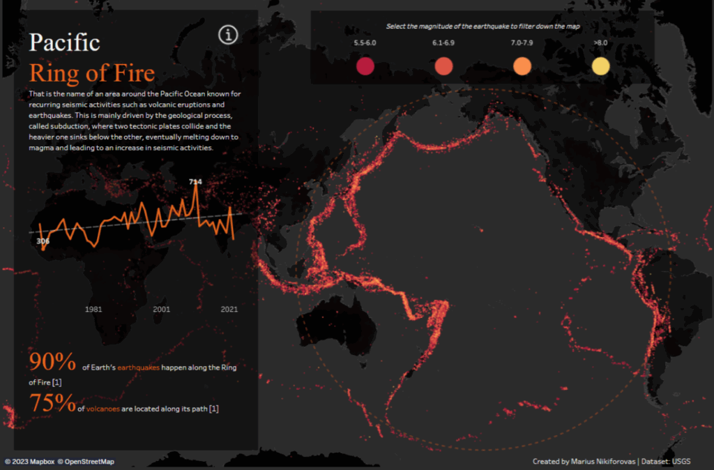
The collective agreement can also be used. This helps the user, via unconscious bias, to understand the meaning of the use of a color. Thus, in the visualization Pacific Ring of Fire by Marius Nikiforovas below, the choice of red, orange and yellow are suitable colors for the representation of fire or lava. Be careful, however, to identify the target audience for your dashboard. Collective agreements may vary from one part of the world to another.
As mentioned earlier, the purpose of colors is to highlight information. Consequently, most of the text in our dashboard can be neutral, in shades of grey, black or white against a dark background. The same applies to all less important data. In the case of year-on-year data comparisons, the reference year can be in a neutral color, helping to highlight the most recent data.
“ Less is more
In many cases, it will be more pleasant and understandable to use a limited number of different colors. Being clear about your intentions in representing your data will enable you to limit the diversity of elements to be highlighted, and thus enable you to limit the number of colors to be added to your color palette.
The most common color theories are complementary and analogous colors. On a color wheel (such as theAdobe Color color wheel below), the complementary colors are opposite: red and green. These colors are preferred for categorizing, differentiating according to a criterion. Analogous colors are side by side: red and pink. These colors can be used to present a variation of the same whole, to create a sense of continuity.
It has also been scientifically proven that warm colors such as red or orange can arouse an emotional response in users. Cooler colors such as green or blue have a more soothing effect. What’s more, pastel colors attract less attention than saturated colors. So, if you want to alarm a user by presenting them with an indicator, a warm, saturated color will have a much more effective effect than a cold or pastel one.
To sum up, it’s essential to define the purpose of your dashboard. This will enable you to define an appropriate palette with warm or cool colors, depending on the emotion you wish to evoke. Saturated colors to attract the eye and possibly differentiate between two shades in your palette.